Popstar

Healthy fun frozen into a brand

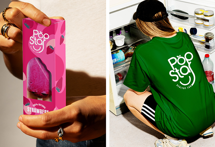
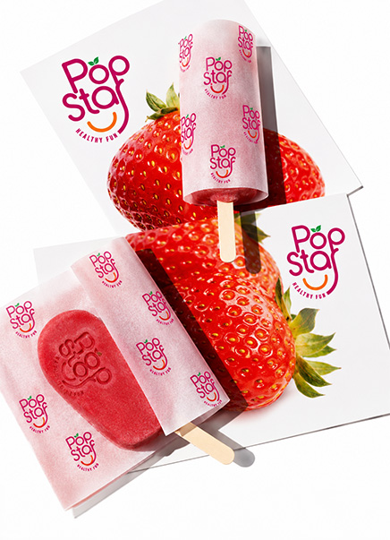
Popstar is a natural ice pop brand built for the simple joy of summer. We shaped its positioning around Healthy Fun, then turned it into a smiling identity, a juicy fruit-led palette and packaging that wears its clean credentials proudly.

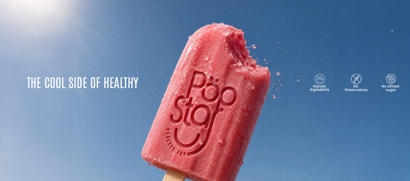
No preservatives. No refined sugar.

Just a brand that tastes as good as it looks, from the freezer to the feed.

Visual Hierarchy

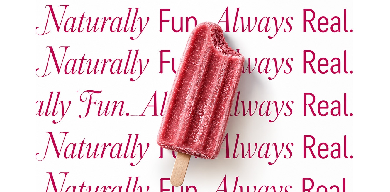
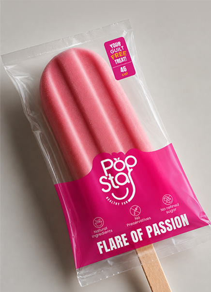
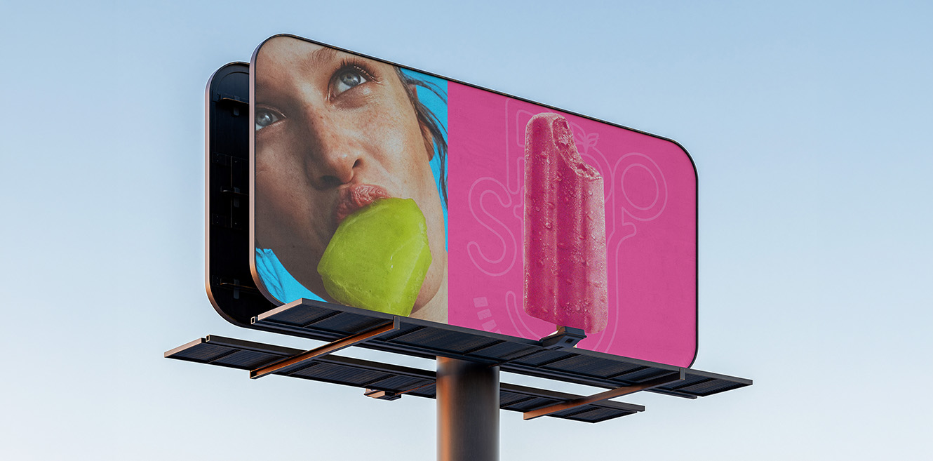
The smile leads. Popstar’s stick curves into a grin and is embossed right into the ice pop, so the product becomes the logo. Colour follows as flavour, with Berry Pink, Mango Orange and Leaf Green claiming the shelf before a word is read. Brand lines like The Cool Side of Healthy form the second read, often repeated as type walls. Health cues come next in small, consistent icons and a 46 cal badge, while nutrition and storage details close quietly at the bottom.

Components

• Logomark. Stacked bubbly wordmark with a leaf-topped O and a smiling stick.

• Colour. Berry Pink, Mango Orange and Leaf Green with a pastel secondary set.

• Typography. Rounded display, condensed sans and an expressive italic serif.

• Packaging. Fruit-led carton sleeves and flow-wrap packs.

• Iconography. Ingredient claim icons and a sticker-style calorie badge.

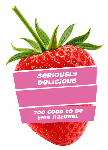
• Collateral. Fruit stickers, tees, carry bags and cooler branding.

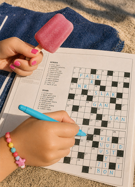
• Social. Macro product shots with playful sticker copy.
Design Labs by Tonic

The design-first lab inside Tonic Worldwide.

Made in Mumbai, Bengaluru, Delhi and Dubai. Felt everywhere.

By subscribing you agree with our

@ 2026 Tonic Worldwide. All rights reserved.