Oriano

One loop powering limitless energy

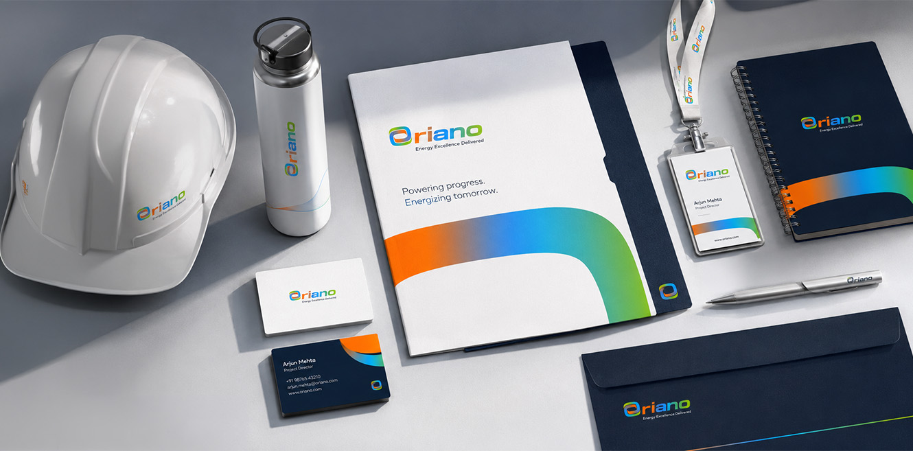
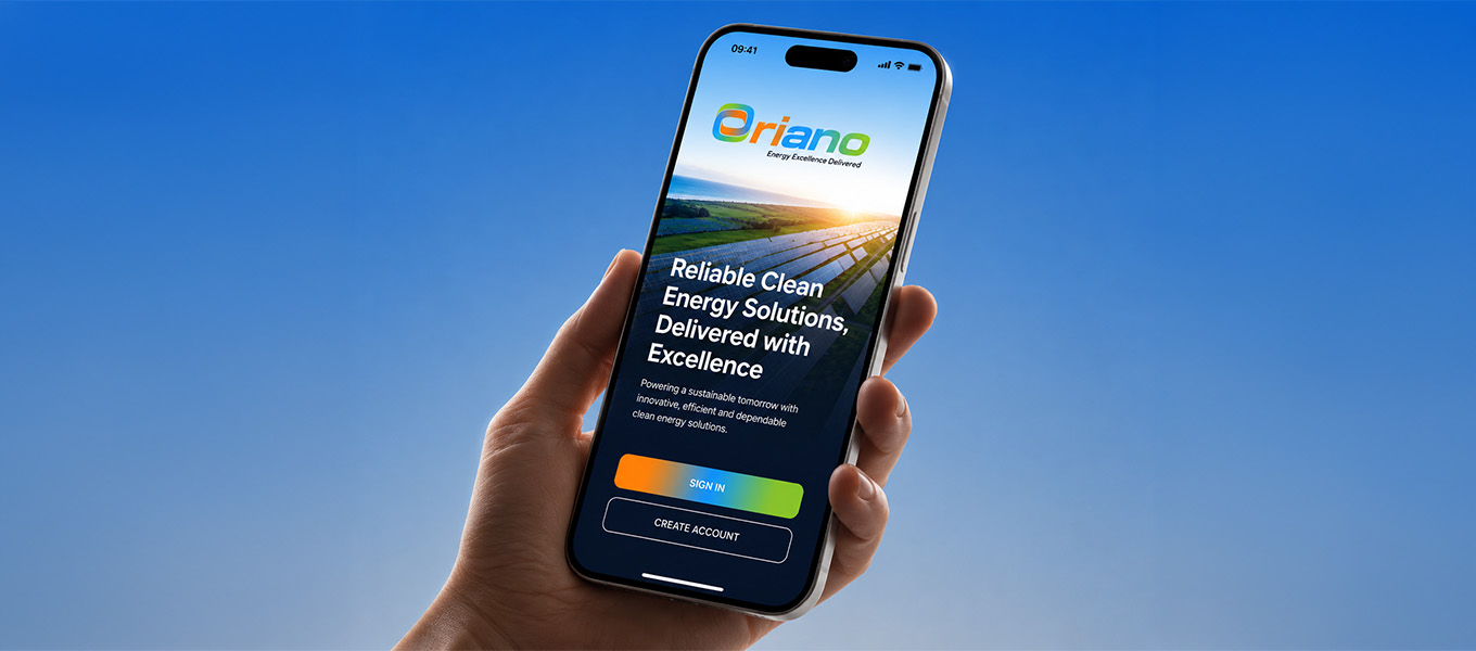
Oriano is an energy solutions company working across power, renewables and infrastructure. The brand needed to reflect scale, ambition and long-term relevance. We built the identity around a continuous loop, a symbol of unity and flow, rendered in a gradient that moves from heat to sky to earth. The system runs from logo construction to app screens, fleets and campaigns.

Visual Hierarchy

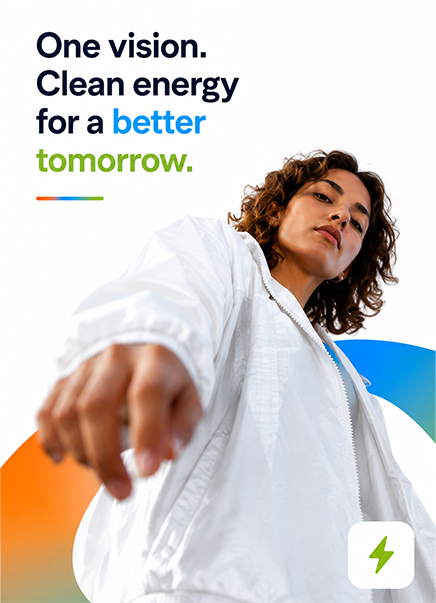
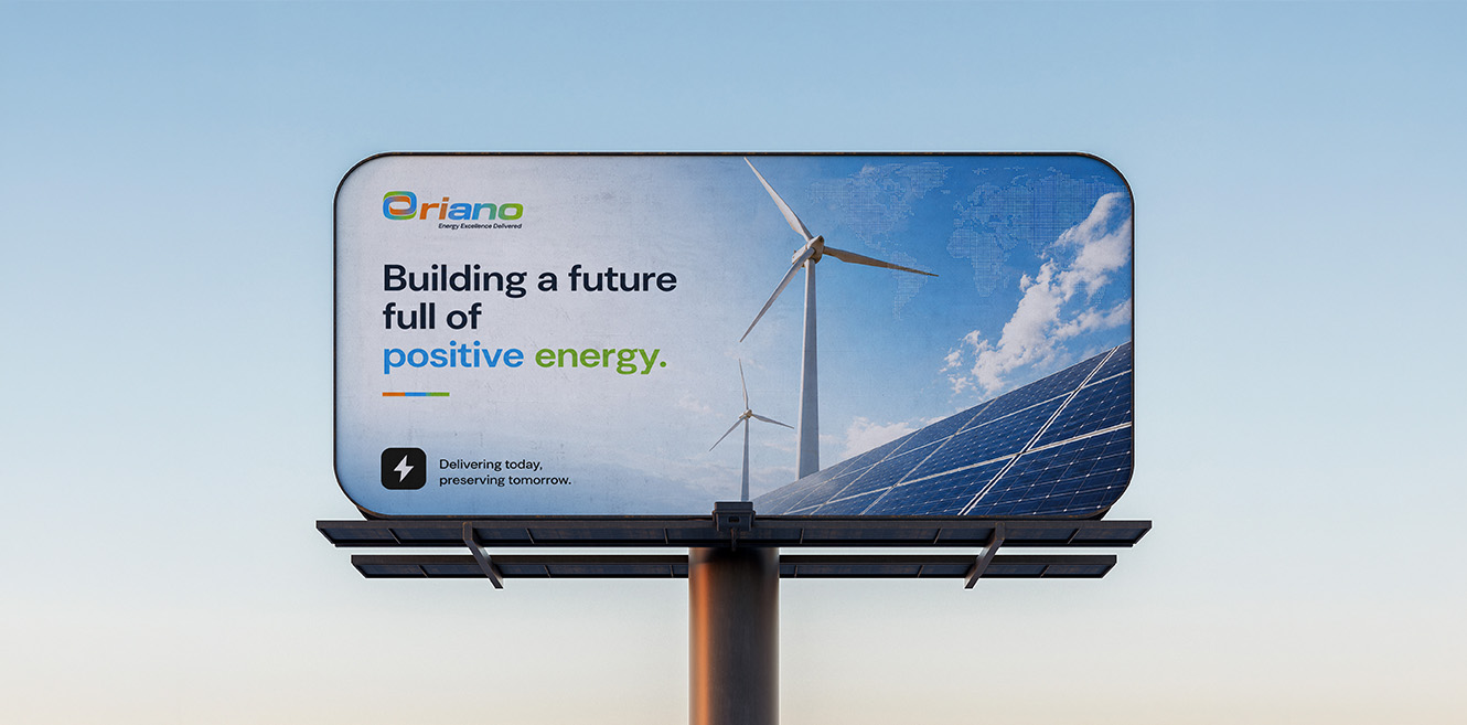
The loop leads everything, and at scale it becomes a window framing turbines, solar fields and grids. The orange to blue to green gradient follows, telling energy, reliability and sustainability in a single sweep. Bold headlines like Powering Progress carry the voice, backed by big proof points such as 1.2GW+ and pillar cards. The Energy Excellence Delivered descriptor and contact details close the read in clean, quiet sans.
Components

  • Logomark. Outer loop, inner loop and flow connection in one symbol.
  • Construction. Rounded-square geometry with x clear space on all sides.
  • Logotype. Rounded wordmark with the symbol as the O at 1H to 5.2H.
  • Colour. Orange, electric blue and green on navy and white.
  • Typography. Geometric sans in heavy and regular weights.
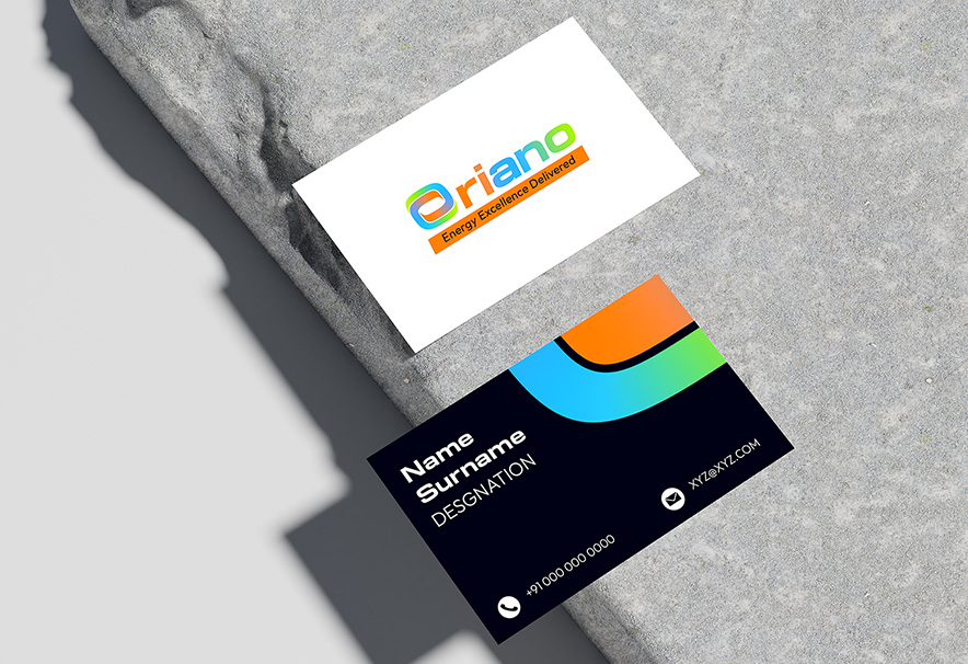
  • Stationery. Cards, envelopes, lanyards and ID badges.
  • Digital. App onboarding, social post system and web banners.
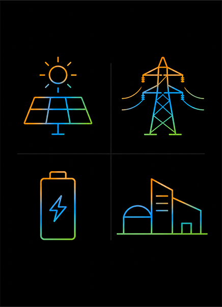
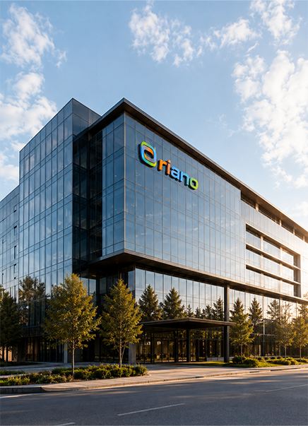
  • Environmental. Container and building branding with a line pattern.

Design Labs by Tonic

The design-first lab inside Tonic Worldwide.

Made in Mumbai, Bengaluru, Delhi and Dubai. Felt everywhere.

By subscribing you agree with our

@ 2026 Tonic Worldwide. All rights reserved.