Karakha

The chai glass became the brand

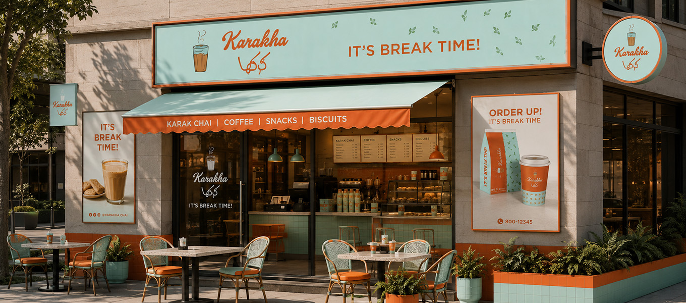
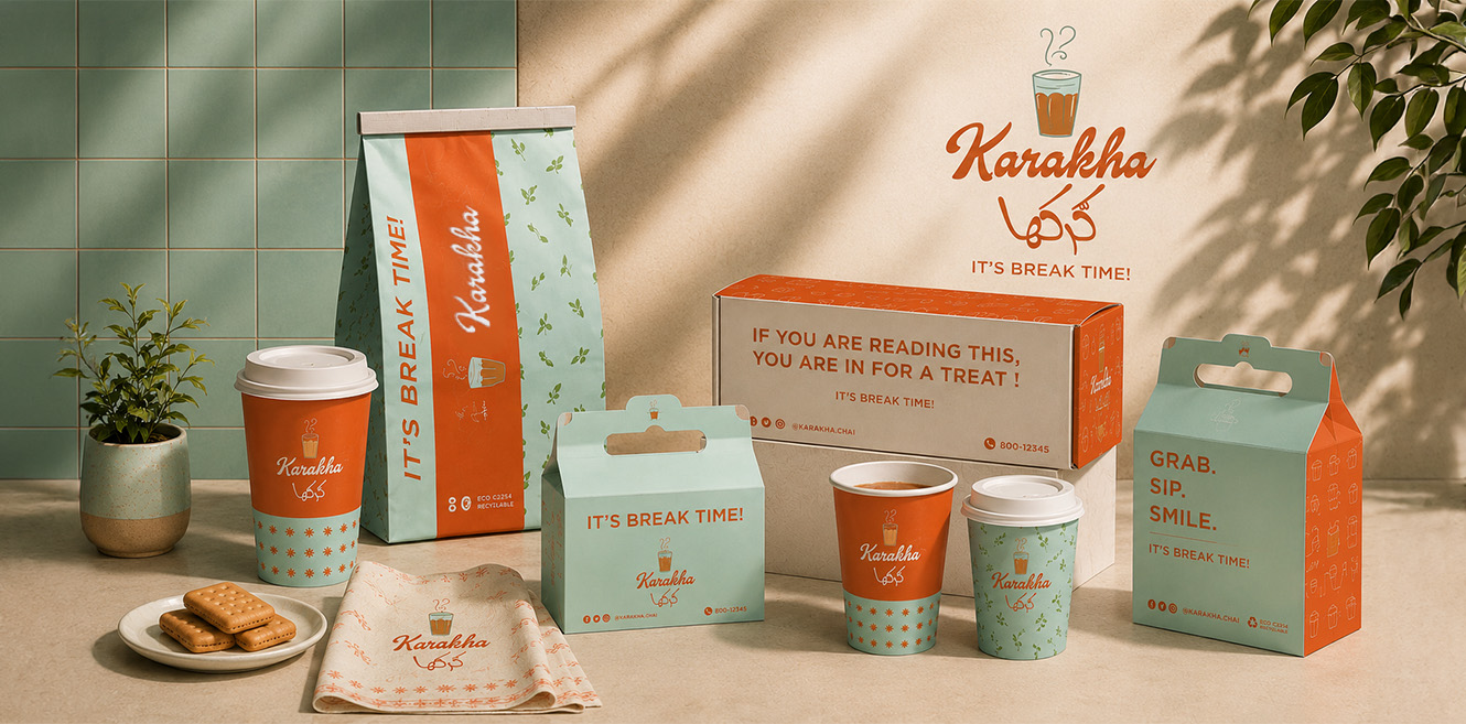
Karakha was envisioned as the meeting point between the ease of a local cafeteria and the warmth of a neighbourhood café. We took the iconic ribbed karak tea glass, a symbol everyone recognises, and made it the heart of the identity. Burnt orange, mint teal and a friendly script build a brand that feels like the break you look forward to, every single day.
Visual Hierarchy

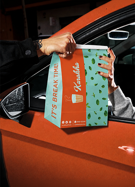
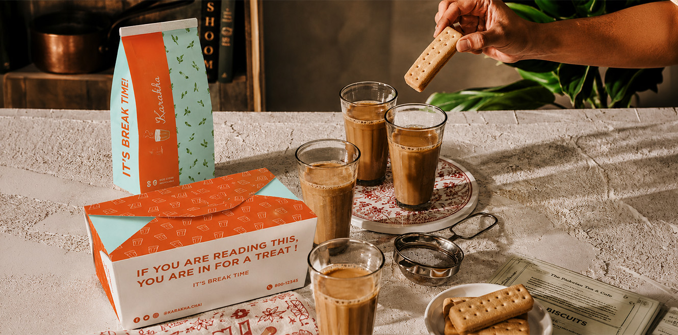
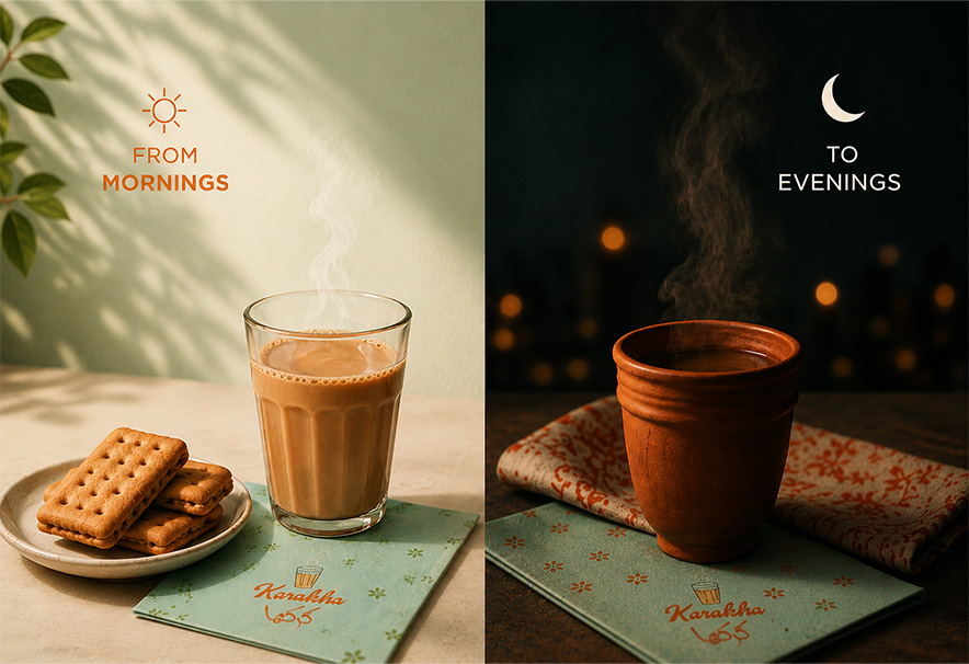
The ribbed karak glass leads, its curl of steam marking every surface as Karakha’s. The warm hand-drawn script wordmark follows and carries the personality. Bold orange and mint teal blocks split every pack so the brand reads from across the street. Break-time lines like It’s Break Time and Like It’s Hot bring the voice, while mint leaf and glass patterns fill the quieter surfaces.

Components

  • Logomark. Ribbed tea glass with a steam swirl and Arabic lockup.
  • Colour. Burnt orange, mint teal, white and warm cream.
  • Typography. Custom script name with bold rounded caps.
  • Patterns. Mint leaf and glass-icon repeats.
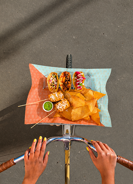
  • Packaging. Bags, boxes, hot and cold cups and food liners.
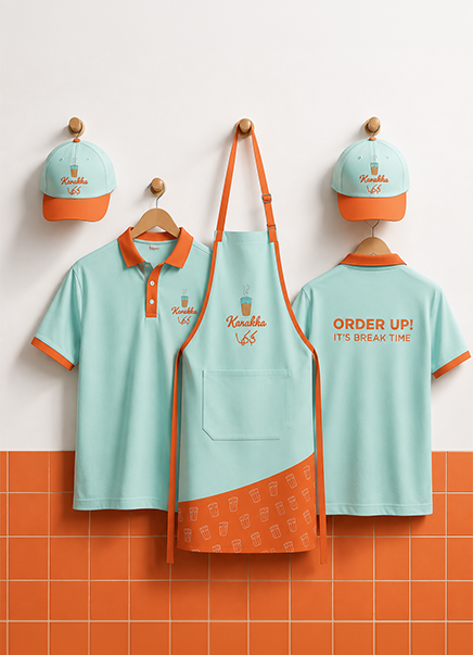
  • Uniforms. Polos, tees, aprons and caps.
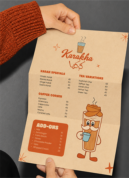
  • Menu. Fold-out menu fronted by a tea glass mascot.
  • Iconography. Glass, steam and leaf icons.

Design Labs by Tonic

The design-first lab inside Tonic Worldwide.

Made in Mumbai, Bengaluru, Delhi and Dubai. Felt everywhere.

By subscribing you agree with our

@ 2026 Tonic Worldwide. All rights reserved.