Dilishius

Designed for pets who are family

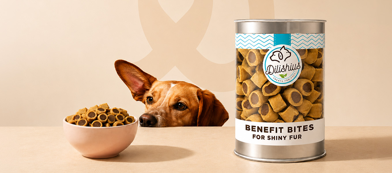
Dilishius was born from a simple belief. Pets are family, and family deserves the very best. We built a warm, trustworthy identity for a natural pet treat brand, anchored by a mark where a dog and a cat share one outline. Hand-drawn ingredient illustrations, clear nutrition storytelling and see-through packaging let pet parents see exactly what goes into every bite.
Visual Hierarchy

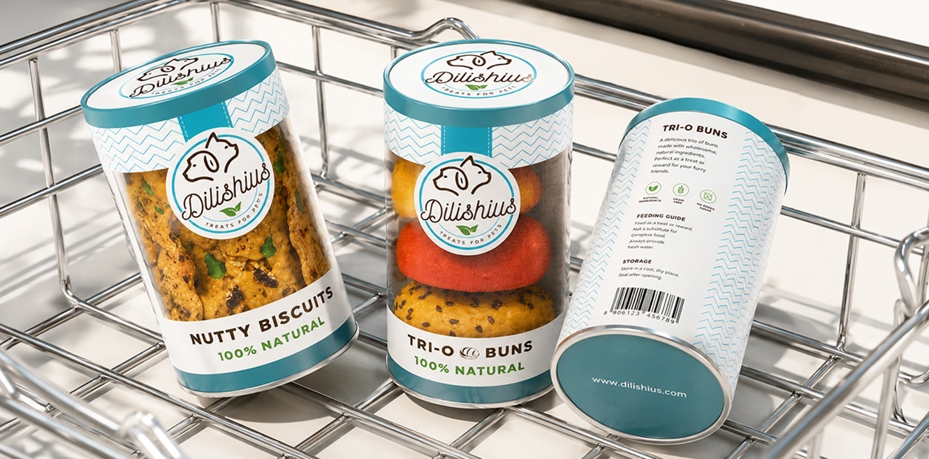
The dog and cat emblem leads, held inside a roundel seal that signs off every surface. The treats themselves come next, shown through clear canisters so the food becomes the hero on shelf. Bold variant names like Nutty Biscuits and Tri-O Buns carry the third read with 100% Natural beneath. Nutrition facts sit in a clean, reassuring data layout, while hand-drawn ingredient doodles add warmth in the background without competing for attention.

Components

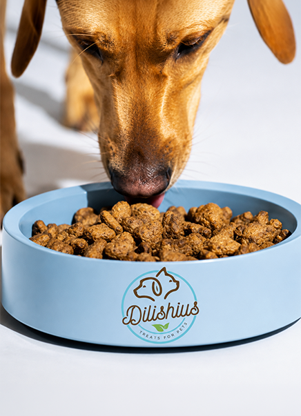
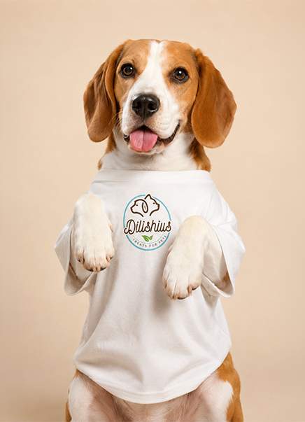
  • Logomark. Dog and cat profiles merged into one line on a circular grid.
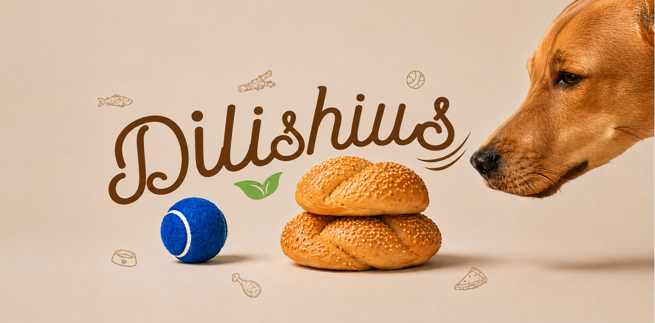
  • Wordmark. Flowing script with a leaf accent and Treats for Pets.
  • Colour. Sky teal, chocolate brown and leaf green.
  • Pattern. Zig-zag chevron bands framing labels and lids.
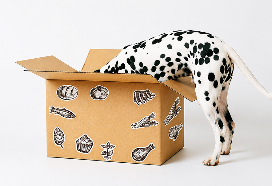
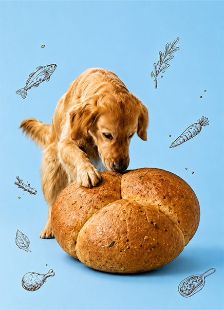
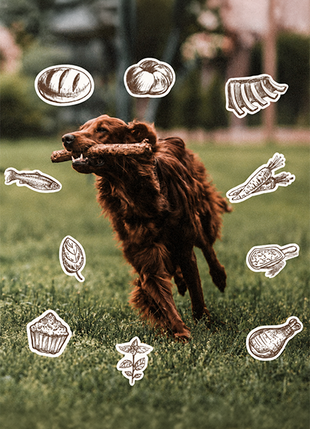
  • Iconography. Hand-drawn ingredient illustrations used as stickers.
  • Packaging. Clear canisters, tins, bakery labels and shipping boxes.
  • Photography. Candid, playful pet portraits.

Design Labs by Tonic

The design-first lab inside Tonic Worldwide.

Made in Mumbai, Bengaluru, Delhi and Dubai. Felt everywhere.

By subscribing you agree with our

@ 2026 Tonic Worldwide. All rights reserved.