Al Maqam

Faith finds its form

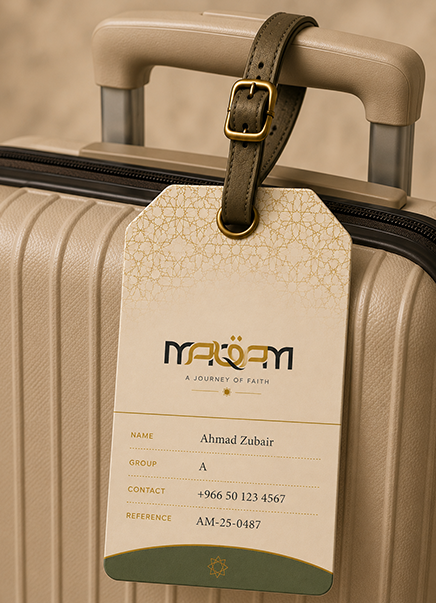
Driven by spirituality, Al Maqam strives to craft pure and divine experiences for pilgrims. It aims to foster humility and support every traveller along the way. We built an identity that bridges sacred geometry and modern hospitality, pairing a flowing gold wordmark with deep charcoal so that calm reverence carries across every card, case and vehicle.

Visual Hierarchy

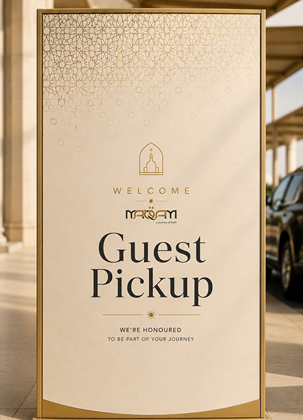
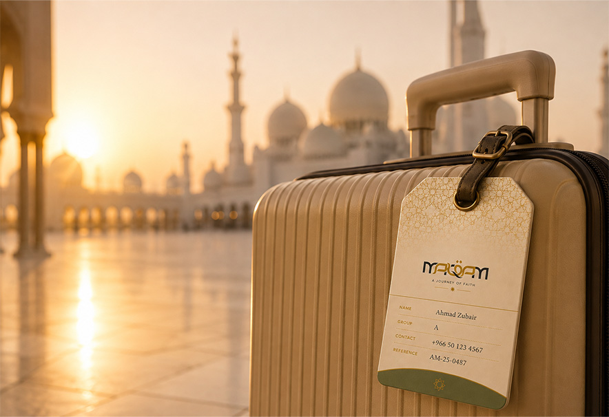
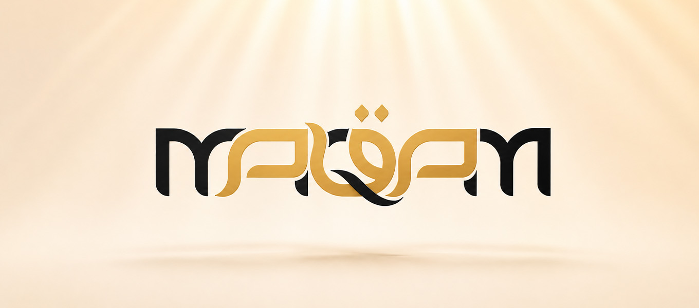
The gold Maqam wordmark leads, its Arabic-inspired rhythm and crescent accent setting a tone of calm reverence. The descriptor a journey of faith follows as the emotional anchor. Islamic star and interlace patterns add depth on dark and marble surfaces. Imagery of mosques, arches, dunes and the Dubai skyline grounds the brand in place and purpose, while contact details close in clean sans with circular icons.
Components

  • Logotype. Latin wordmark with calligraphic rhythm and a crescent.
  • Colour. Saffron gold, charcoal black, white and marble neutrals.
  • Pattern. Eight-point star geometry and fine interlace.
  • Typography. Refined serif headlines with clean sans information.
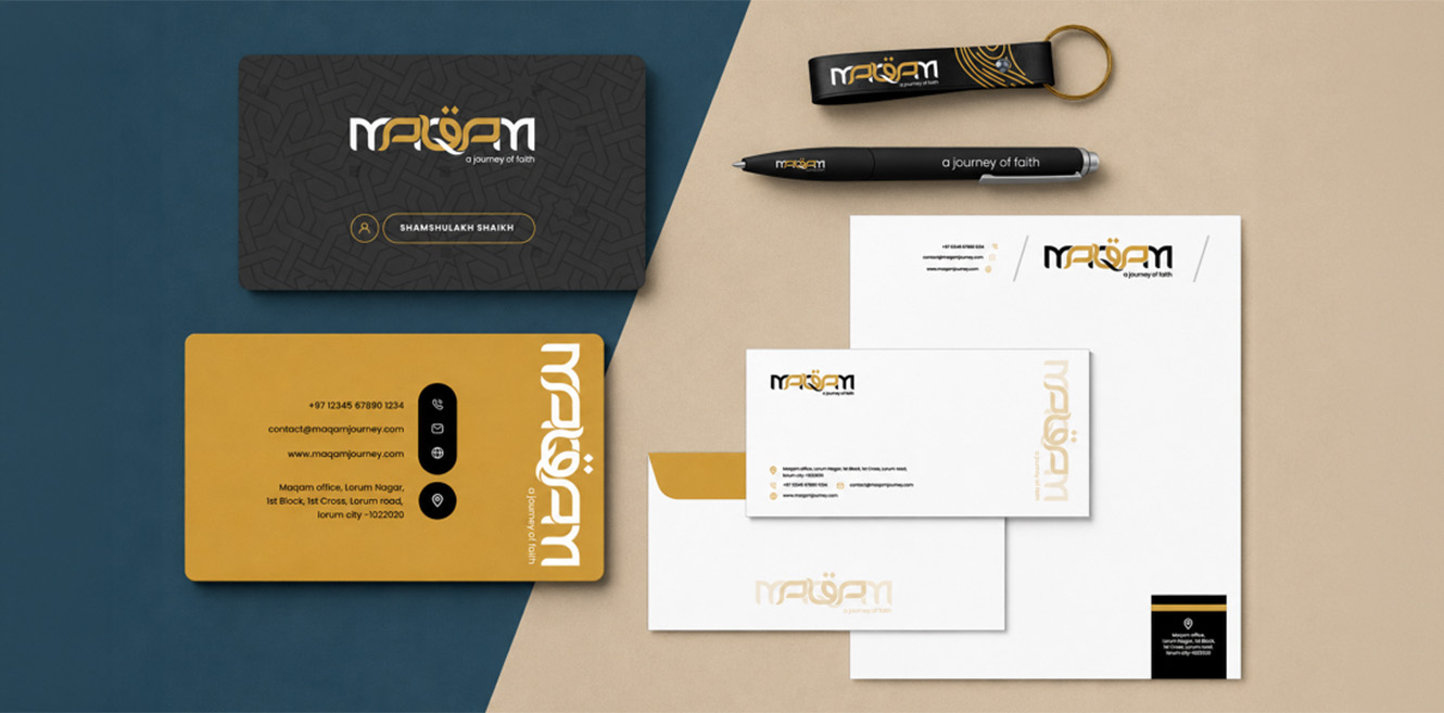
  • Stationery. Cards, letterhead and envelopes.
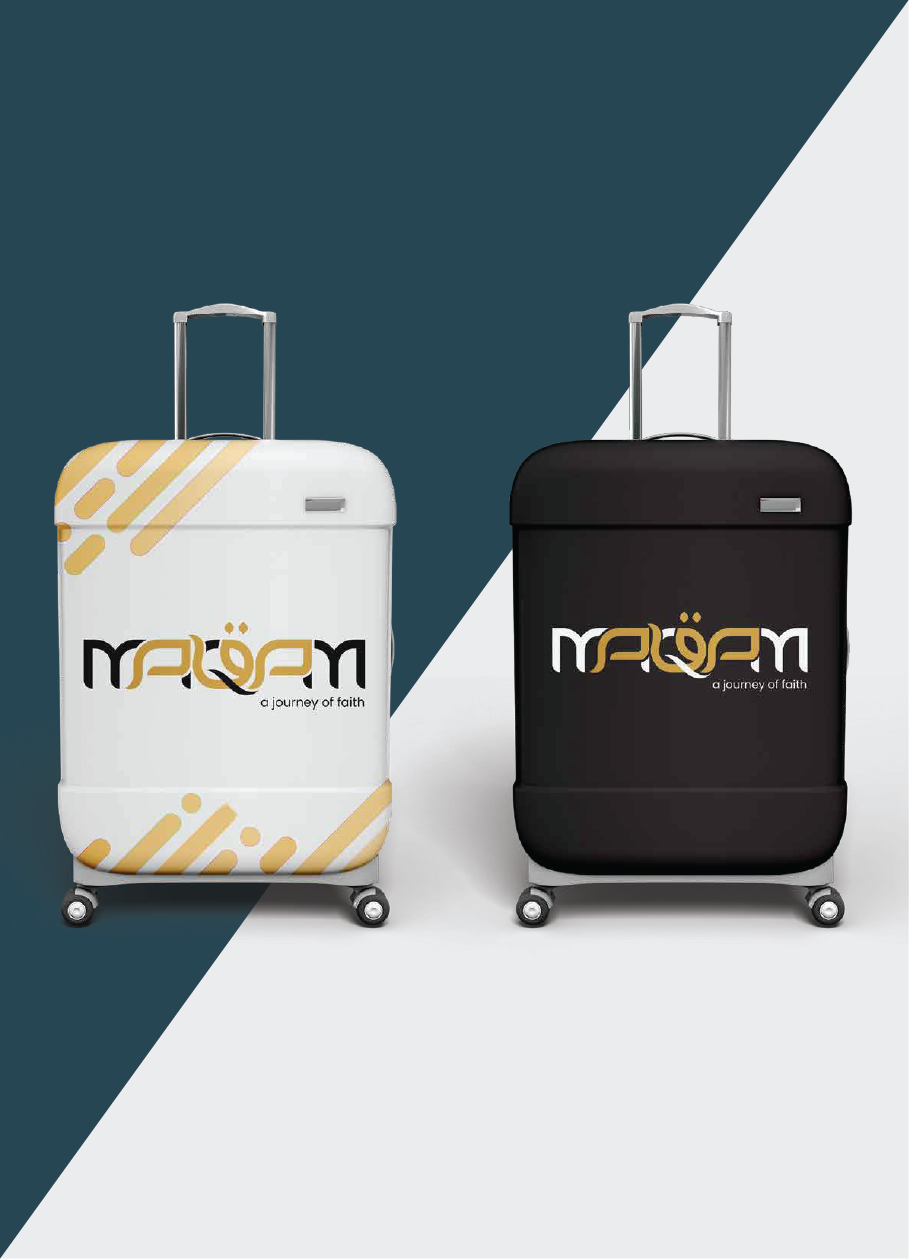
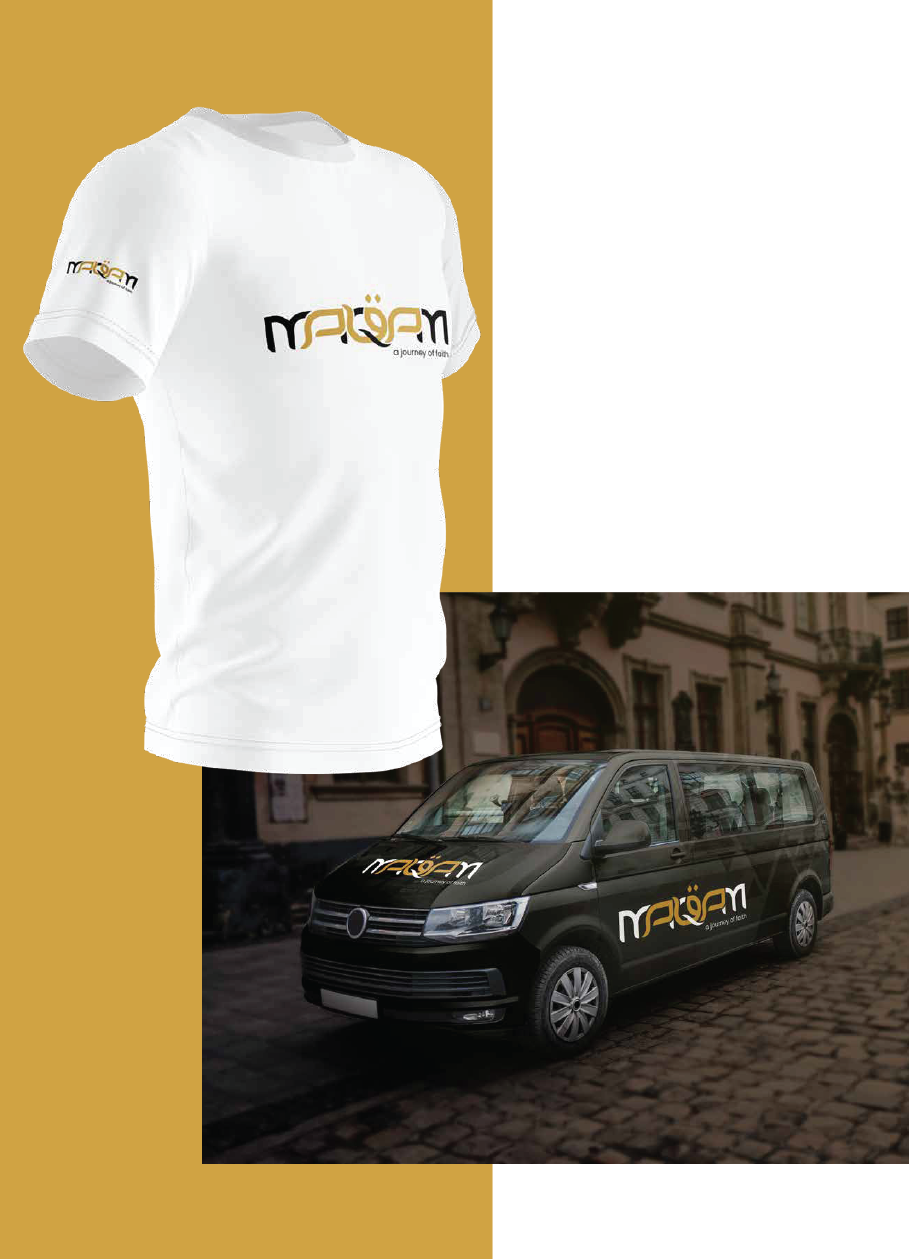
  • Travel Collateral. Luggage, staff lanyards and vehicle livery.
  • Photography. Sacred architecture, light and desert landscapes.

Design Labs by Tonic

The design-first lab inside Tonic Worldwide.

Made in Mumbai, Bengaluru, Delhi and Dubai. Felt everywhere.

By subscribing you agree with our

@ 2026 Tonic Worldwide. All rights reserved.