Everest
Base Camp

We put the story back on the map

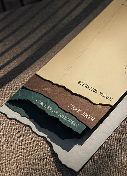
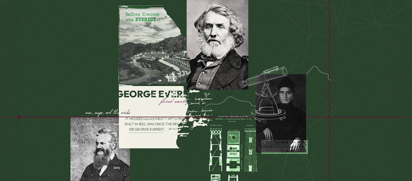
Located at the base of George Everest House in Mussoorie, Everest Base Camp kept getting mistaken for an adventure stay. We rebranded it around its real story, the survey that measured the world’s highest peak. Cartography became the visual language, surveying became the naming logic, and every plate, sign and room became a chapter of the expedition.
Visual Hierarchy

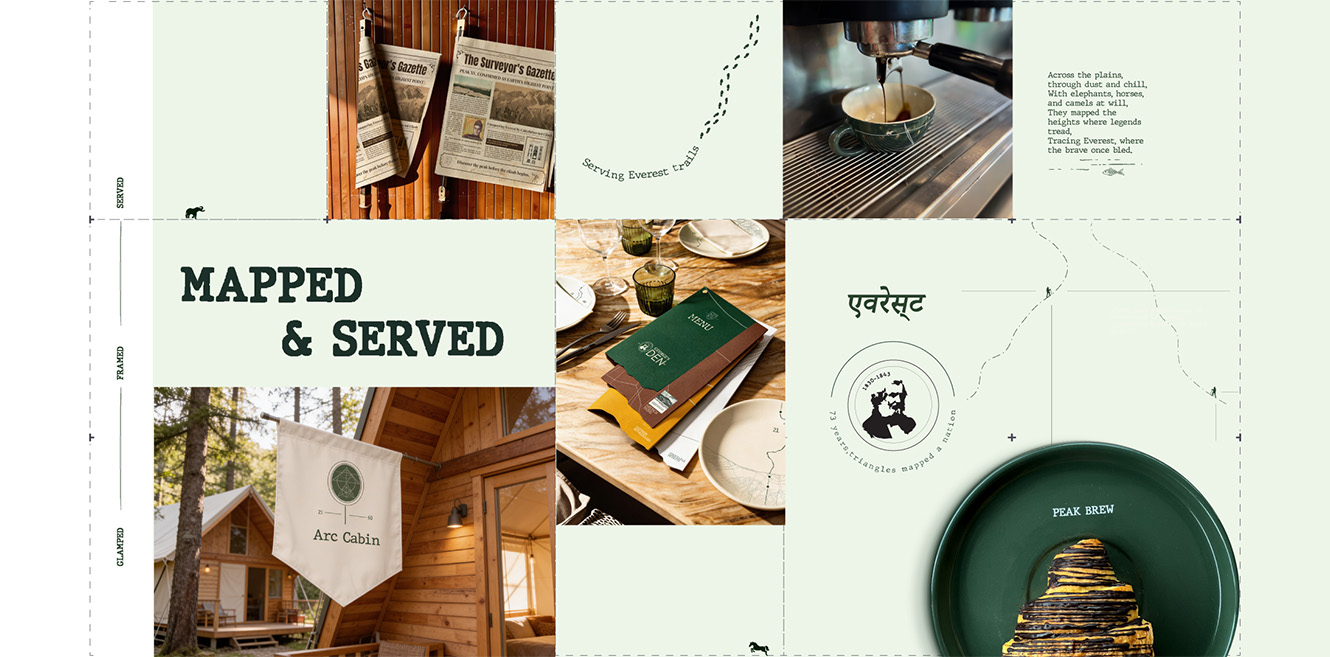
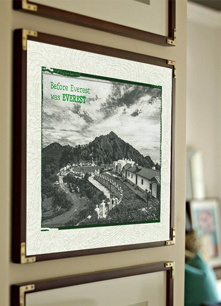
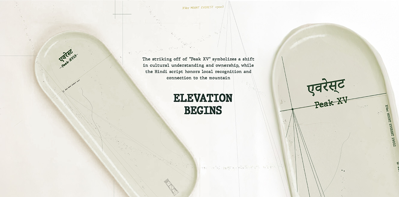
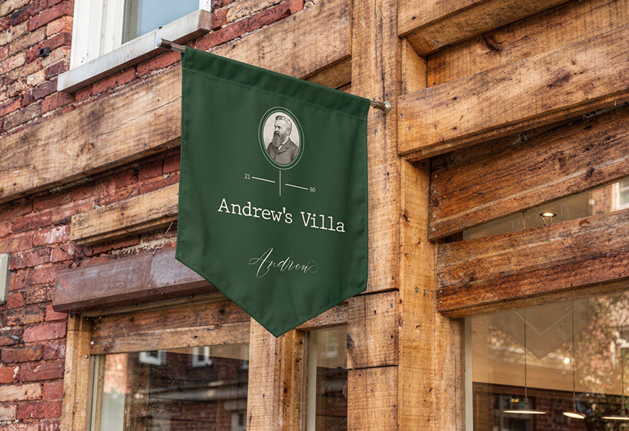
The story leads before the logo does. Contour lines, coordinates and expedition routes set the scene and establish the survey as the brand’s anchor. A three-tier naming architecture of Cabins, Cottages and Villas follows, signalling value through surveying language. Mapped and Served then puts the idea in the guest’s hands through tableware that charts the climb course by course. Pennant signage and in-room print guide the stay, while hand-drawn animals, typewriter notes and survey marks reward the closest look.

Components

  • Colour. Forest green, parchment white and fine-line greys.
  • Typography. Slab typewriter titles, serif storytelling and Devanagari accents.
  • Graphic Devices. Contour lines, survey grids, dotted routes and coordinates.
  • Naming System. Surveying-inspired Cabins, Cottages and expedition-named Villas.
  • Tableware. Starter, cup and dinner plates mapped to height, curve and aerial view.
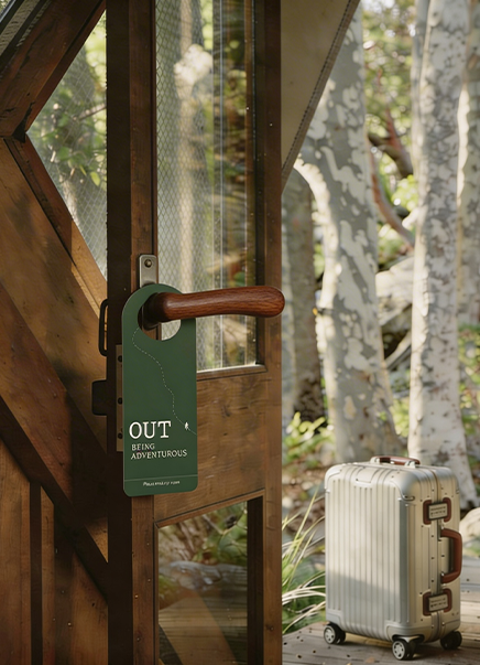
  • Wayfinding. Hanging pennant room signs and medallion markers.
  • In-Room Collateral. Door hangers, pillow menu, room guide and toiletry labels.
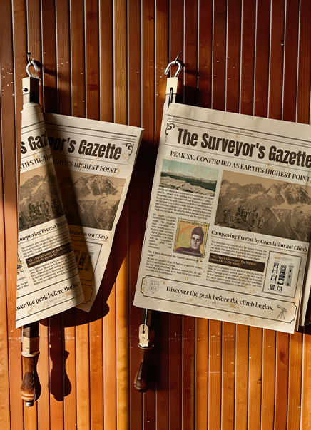
  • Interactive Print. The Surveyor’s Gazette newspaper and a Field Notes journal.
  • Film. Watch the Journey brand film.

Design Labs by Tonic

The design-first lab inside Tonic Worldwide.

Made in Mumbai, Bengaluru, Delhi and Dubai. Felt everywhere.

By subscribing you agree with our

@ 2026 Tonic Worldwide. All rights reserved.